Grace Gow: Horizontal Responsive Website Redesign
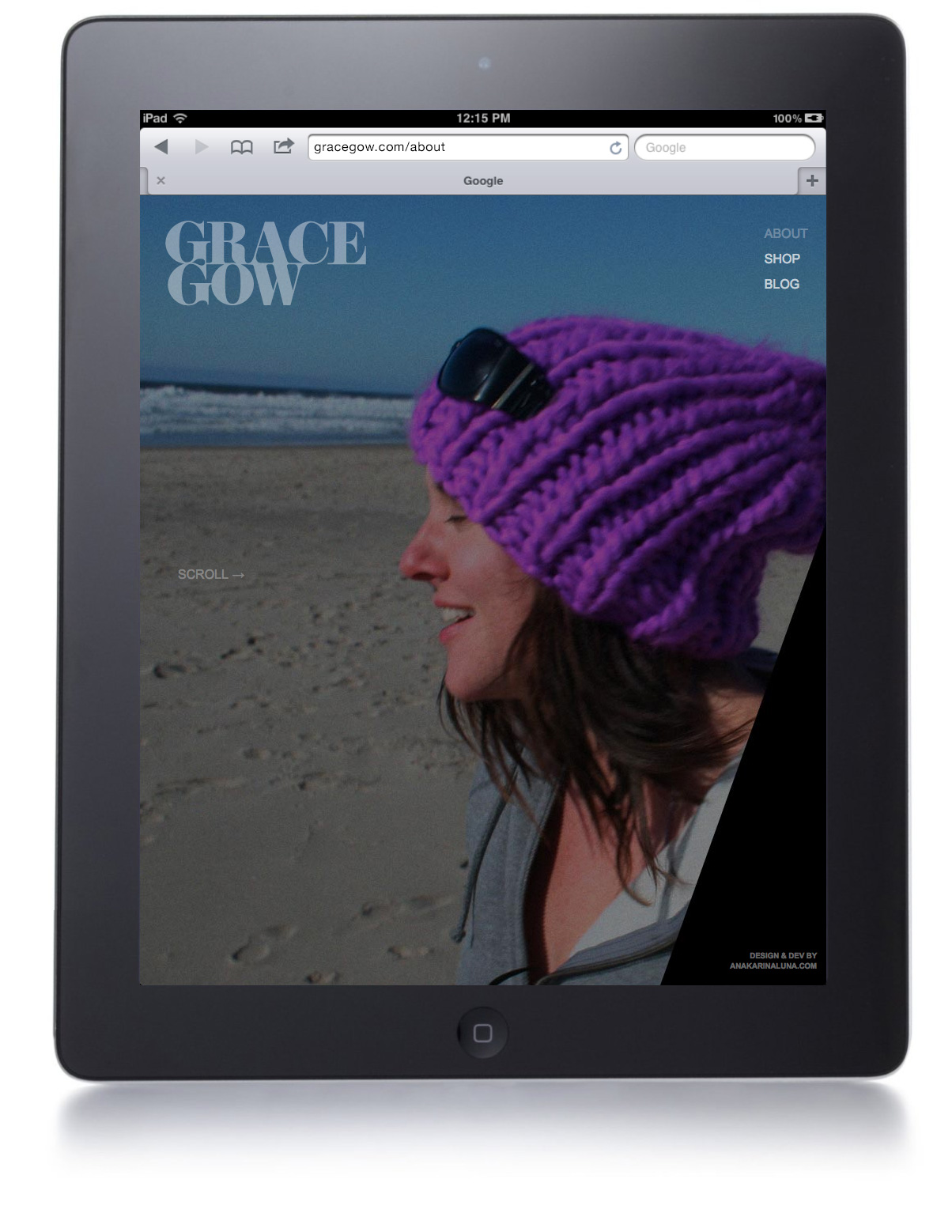
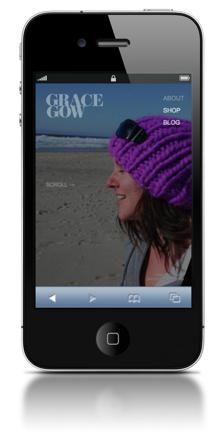
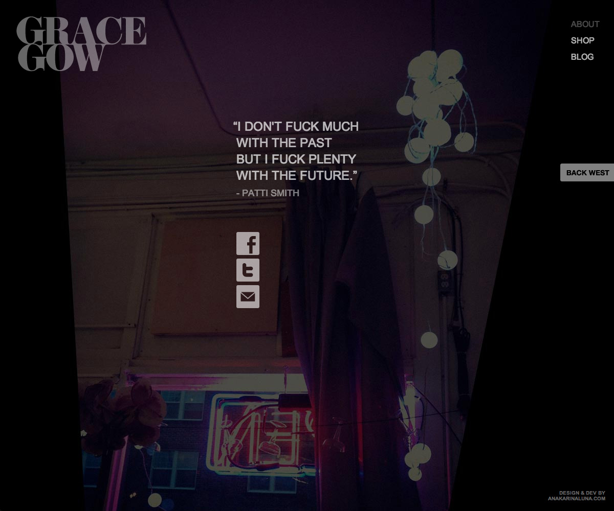
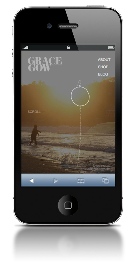
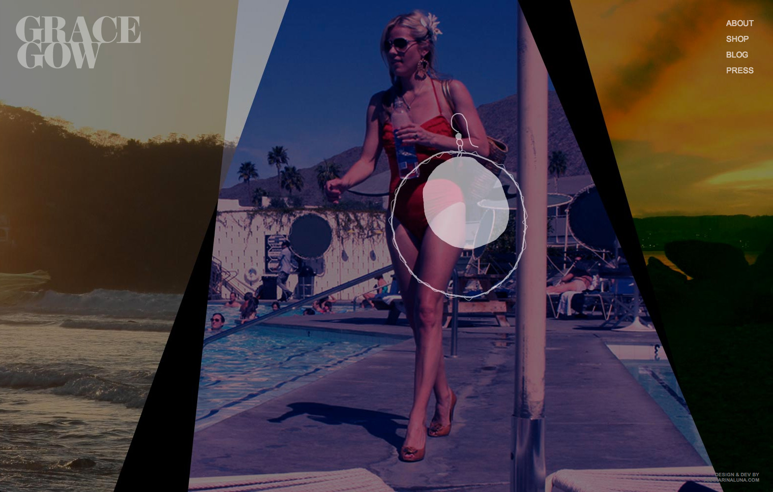
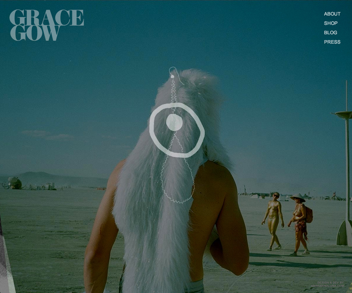
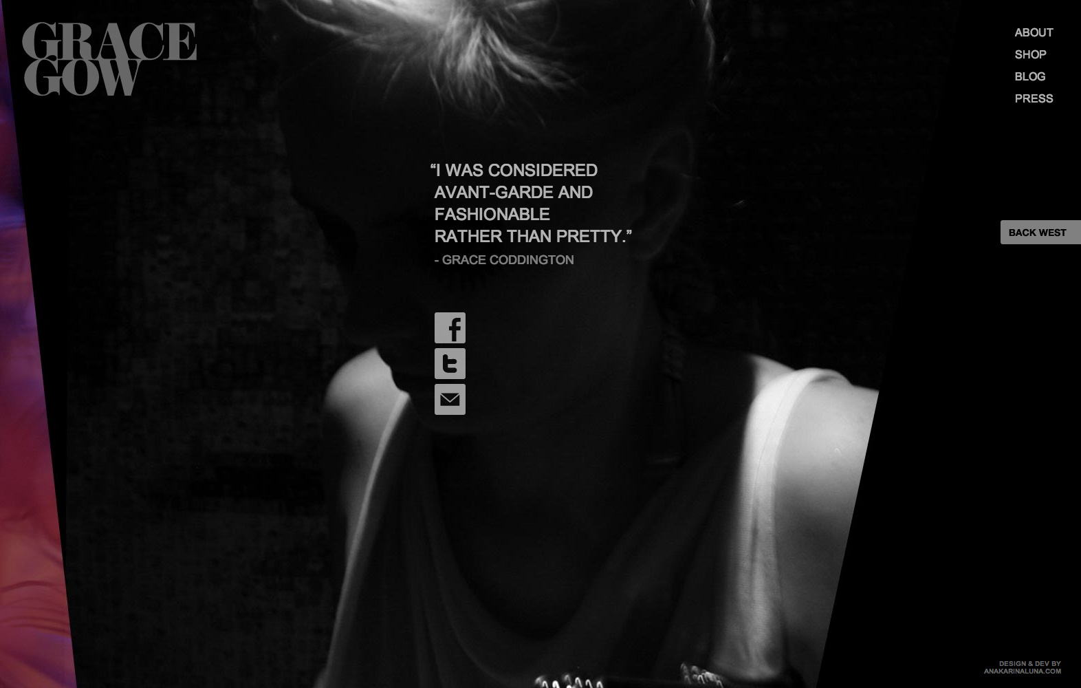
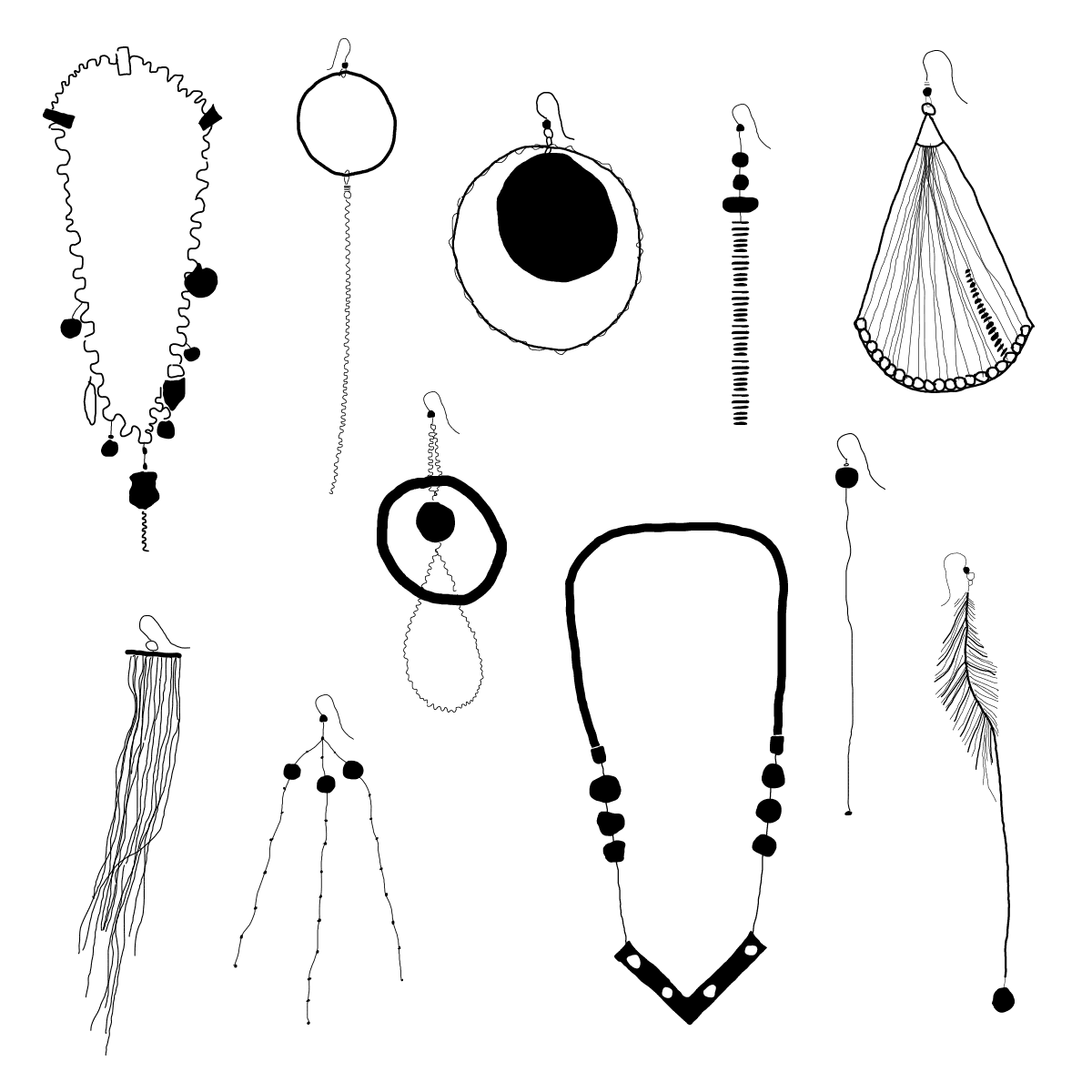
Grace Gow is a hand-crafted jewelry horizontal site with a focus on the brand vibe, rather than products and social media. A WEB 2.0 approach allows features such as 'store' and 'blog' to be handled externally—by Big Cartel and WordPress—freeing the site to be a hub targeted at branding aspects. The core aspect of the brand are dualities: gritty and poetic, beach and city, light and shadow, communicated strongly throught photography layout and composition—photos are entirely from the owner's collection to maintain a sense of authenticity and personal touch. The experimental flavor, also part of the brand, was accomphished by a horizontal experience. The mouse wheel scrolls the site horizontally, for ease of use. Illustrations (by me) of actual collection pieces underline the handmade, one-of-a-kind quality of Grace Gow's jewelry, as they overlap the duality imageries. Feedback from users have confirmed we succeeded on our goal to communicate a sense of duality and handmade, as well as the vibe of an experimental brand. My responsibility: art direction, UX, visual design, illustration, development. Visit site →
/// Homepage

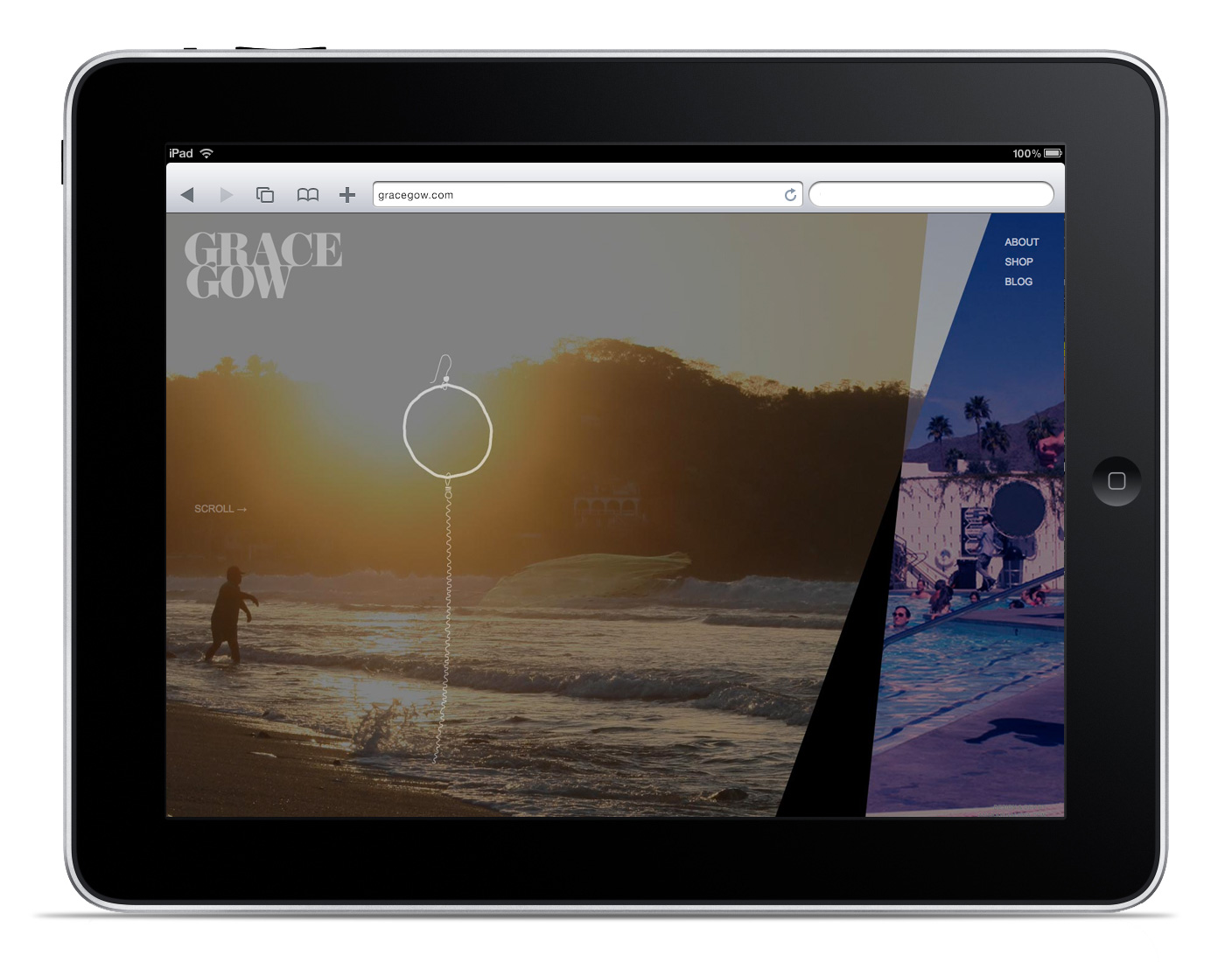


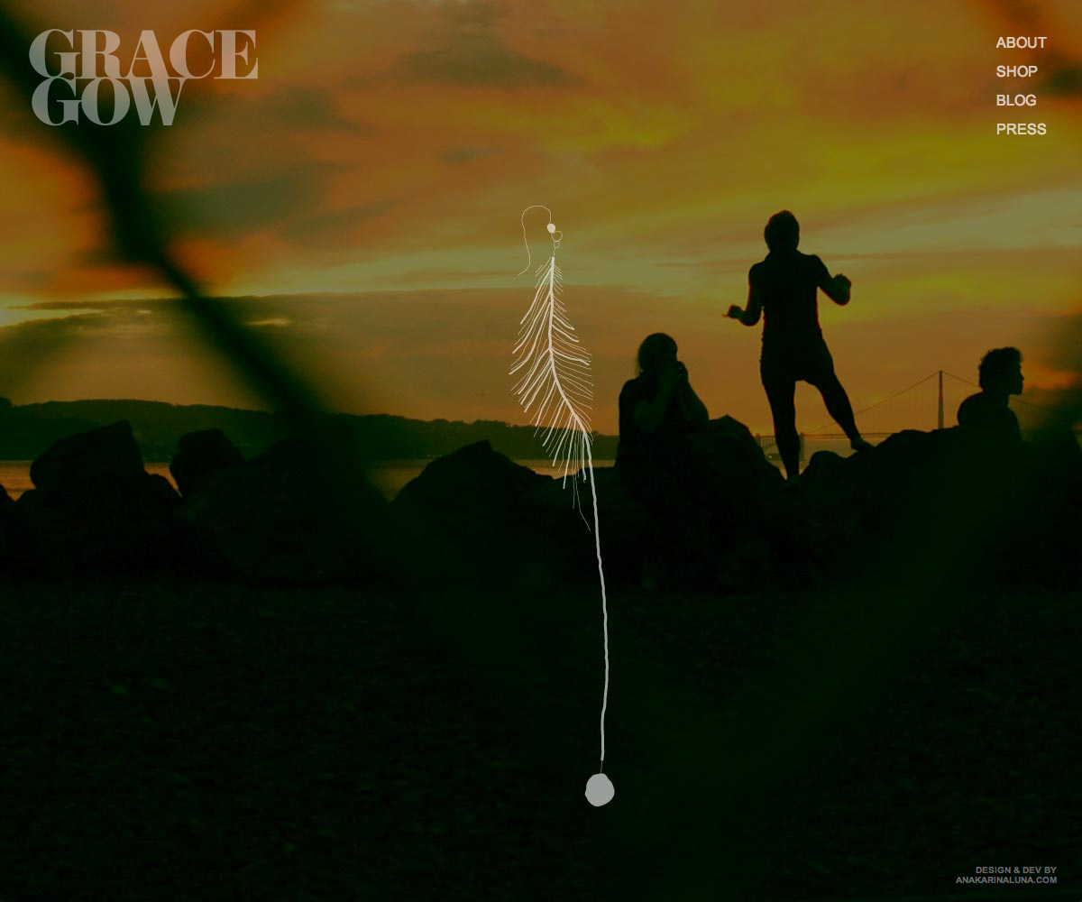
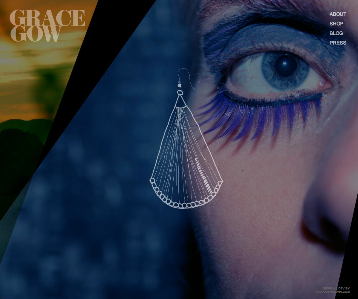


/// Illustrations
/// About Page

